|
|
Post by bluebiro on Sept 8, 2022 19:40:21 GMT
Let’s have the coat of arms. Let’s go back to the 70s and bring back bovver boots and terrace fights whilst we’re at it too. let's not forget the donkey jacket. |
|
|
|
Post by lympstonegas on Sept 8, 2022 19:47:59 GMT
Personally I rather have a badge/ crest incorporating the Bristol coat of arms . We’ve been there and had that in the 60’s |
|
|
|
Post by warehamgas on Sept 8, 2022 19:52:59 GMT
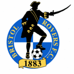
I quite like the current one, it’s basic, incorporates the quarters, the ‘black pirate’, our date and is noticeable all over the world. It’s standoutness is good and recognisable in itself. You don’t need to get close to see it’s us. I’ve seen it all over the world from a distance, it does stand out!
But, the email from the club was decent. It sets out a process and they are doing their best to involve us. If you’re going to change anything this process seems ok. I’d say it’s not needed but...if you’re going to then this seems a decent way to do it.
I hope there is an option not to change it but I bet with all this effort that will not be an option!
UTG!
ps. I hope this doesn’t upset anyone but please no circle design which you need a magnifying glass to see who it belongs to or anything that is so subtle you have to ask ‘what the....is that?’ (I know part of our current badge does have a circle design in it but it doesn’t come over as a circle design)
|
|
Deleted
Deleted Member
Posts: 0
|
Post by Deleted on Sept 8, 2022 20:01:35 GMT
I hope the powers that be hav'nt already decided who will be on the panel to decide a new badge.
|
|
|
|
Post by gulfofaden on Sept 8, 2022 20:14:03 GMT
You realise that skulls and crossbones make us the baddies?
|
|
|
|
Post by bluebiro on Sept 8, 2022 20:15:47 GMT
I hope the powers that be hav'nt already decided who will be on the panel to decide a new badge. that's a given. Like any panel |
|
|
|
Post by gasandelectricity on Sept 8, 2022 20:16:19 GMT
You realise that skulls and crossbones make us the baddies? Are we the bad guys? |
|
|
|
Post by olskooltoteender on Sept 8, 2022 20:16:34 GMT
It has to change . One person who has moved to Bristol has probably complained about it Probably from London . . . |
|
|
|
Post by rainhamgas on Sept 8, 2022 21:20:59 GMT
I love the badge. I think it’s unique and immediately identifiable. I don’t want a *ing gash bird or anything like that. Come on people, we’ve got a pirate on our badge…..a pirate ~ how cool is that?!
|
|
|
|
Post by gulfofaden on Sept 9, 2022 3:42:57 GMT
I love the badge. I think it’s unique and immediately identifiable. I don’t want a *ing gash bird or anything like that. Come on people, we’ve got a pirate on our badge…..a pirate ~ how cool is that?! Pirates got up to some pretty shady sh**. |
|
|
|
Post by RD on Sept 9, 2022 5:50:55 GMT
I love the badge. I think it’s unique and immediately identifiable. I don’t want a *ing gash bird or anything like that. Come on people, we’ve got a pirate on our badge…..a pirate ~ how cool is that?! Pirates got up to some pretty shady sh**. Arrrrrgh you sure? Jesus, I'll show myself the door. Edit: show myself the plank 😁 |
|
|
|
Post by chippenhamgas on Sept 9, 2022 5:58:28 GMT
Thank god we have people in charge dealing with the important issues the club faces.
|
|
|
|
Post by badengas on Sept 9, 2022 6:58:45 GMT
Thoughts & prayers with every Gashead rocking the current badge Tattoo Thank you. I got mine when we dropped down to the Conference and if I must have another only want a new one to celebrate our entry to the Premier League. Wael and Tom, please don't change it. If you do, my right calf is available for a new tattoo which you can film being done and use as a tweet to release it. |
|
|
|
Post by Sir Trevor B'Sol on Sept 9, 2022 7:38:53 GMT
Worth considering.
Things NOT REQUIRED.
A bird with a prominent red breast.
The Clifton Suspension Bridge.
A black and white panelled football.
The Bristol Coat of Arms.
The years 1894 and 1982.
RED.
Things TO CONSIDER.
BLUE.
The Gas theme.
The Pirate concept.
The year 1883.
Visual simplicity.
Quarters.
Our future home.
Only change the crest if the new image is easily recognisable, is unique and has broad support.
|
|
|
|
Post by fanboy on Sept 9, 2022 7:42:00 GMT
Whoever thought this idea up needs the sack so they can go work somewhere else where they actually need a rebrand I actually think the general response shows it was worthy of a survey. |
|
|
|
Post by titchthephot on Sept 9, 2022 8:47:00 GMT
Do we still use the word 'Pirates' when referring to us? Gas, yes, but I never think of us as the Pirates. Maybe it is time for a change but it will have to be a superb iconic design or we may just as well stick with what we have. Something incorporating the word 'Gas' - I don't think a Gasometer would be a good look though!!
|
|
|
|
Post by dudelebowski on Sept 9, 2022 8:47:20 GMT
Not many FL clubs with a badge as old as ours. Id wager we’ve probably had the current one longer than most of the other 91 clubs.
|
|
|
|
Post by richmace on Sept 9, 2022 8:55:57 GMT
This is exactly how I feel. I definitely think we should look into it though, our current badge has some very basic errors. EG. We must be the only "crest" in the country that doesn't centrally align properly (because the sword sticks out). Looks so bad on TV/apps etc. I don't hate it at all - but it does look quite dated and it very much feels like a... "well, it'll do" for me atm. The sword sticking out is a bit crap. It also results in the main part of the badge (i.e the circle) being displayed off-centre, which looks awful. |
|
|
|
Post by richmace on Sept 9, 2022 8:59:29 GMT
I would love a design that encorporated the blue & white quarters and a skull & crossbones.
I do like the current badge though.
It is right that the club look at all aspects of the Bristol Rovers brand. I actually think that Bristol City did a good job with their minimalistic new badge design. Also the Bristol Bears logo is very well done. The right design could be very good.
|
|
|
|
Post by percy on Sept 9, 2022 9:02:03 GMT
Would like to keep the current badge but somehow make the sword no longer outside the circle (maybe by the side) for reasons of alignment and must be harder to get on the kit?
Update font and clearer for digital use ok by me
|
|